
loading
zine ☆ publication ☆ storytelling
loading explores the internet as something never finished, always updating and always evolving. Rooted in my own relationship with technology, it traces a shift from the playful, open web of childhood to the more complex and curated digital spaces we move through today.
Positioned between archive and reflection, the project uses the zine format as both a storytelling tool and a way of making sense of lived experience. It builds on the idea of zines as personal records and cultural artifacts, where the act of making becomes a way of understanding memory, change, and identity over time. At its core, loading asks what it means to grow up alongside technology, how it shapes us, how we shape it, and how those early digital experiences continue to echo through the way we navigate the internet now.
the internet is always in progress
.
the internet is always in progress .
Digital spaces will never truly finish. The internet is constantly updating, changing, and shaping how we see and use it. loading reflects my own experience growing up online and moving through different versions of the internet over time.
-
The core challenge of this project was to visually document and communicate my evolving relationship with the internet, using design to translate personal and shared experiences into a cohesive narrative.
-
Research & Concept
The project began by mapping personal memories alongside major shifts in internet culture, establishing a timeline reflecting different eras of growing up online. I explored themes of early computer experiences, flash games and browser culture, the shift to social media, and the positives and negatives of constant connectivity.Zine Development
At the start of the project, I published a survey with the intention of incorporating written responses as body copy. Over time, the survey became a conceptual reference point rather than serving as a primary text. Select responses were included, but the majority influenced the zine’s imagery and tone.Initial sketches were created when I thought the zine would lead with illustration. While all pages remain open to interpretation, I established a structured outline before designing. I decided that a 12-page format provided a balanced framework.
Early design stages involved experimenting in Photoshop as I worked to establish a consistent visual approach. I found that I was taking my themes too literally, which limited the work, and my illustrative style conflicted with the use of found imagery. Shifting direction, I began experimenting with composition, texture, and typography using sourced imagery. This shift led to a more cohesive visual language.
From that point forward, I focused on refining this approach. The process involved typographic exploration in Illustrator before integrating the imagery into Photoshop. I experimented with blend modes, textures, filters, and color palettes to shape each spread. I rotated between Archive.org for imagery, Pinterest for visual references, and Reddit for more written perspectives. I even utilized the Fruitger Aero Archive, an epicenter of all things early 2000s internet. The survey continued to serve as a conceptual guide throughout.
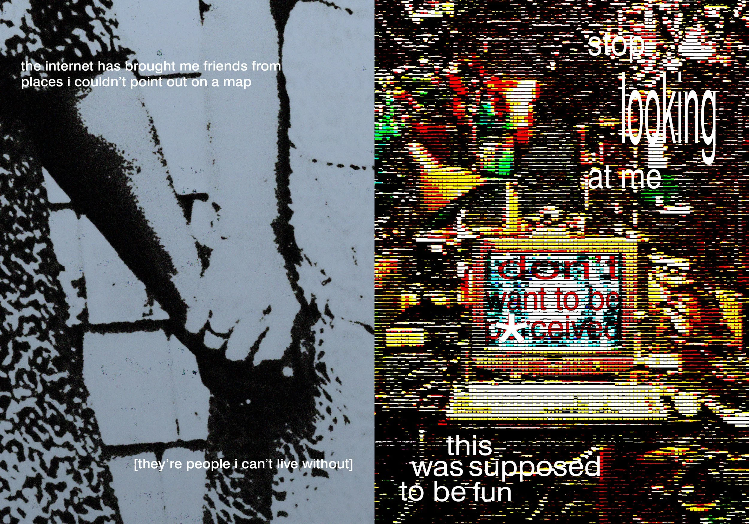
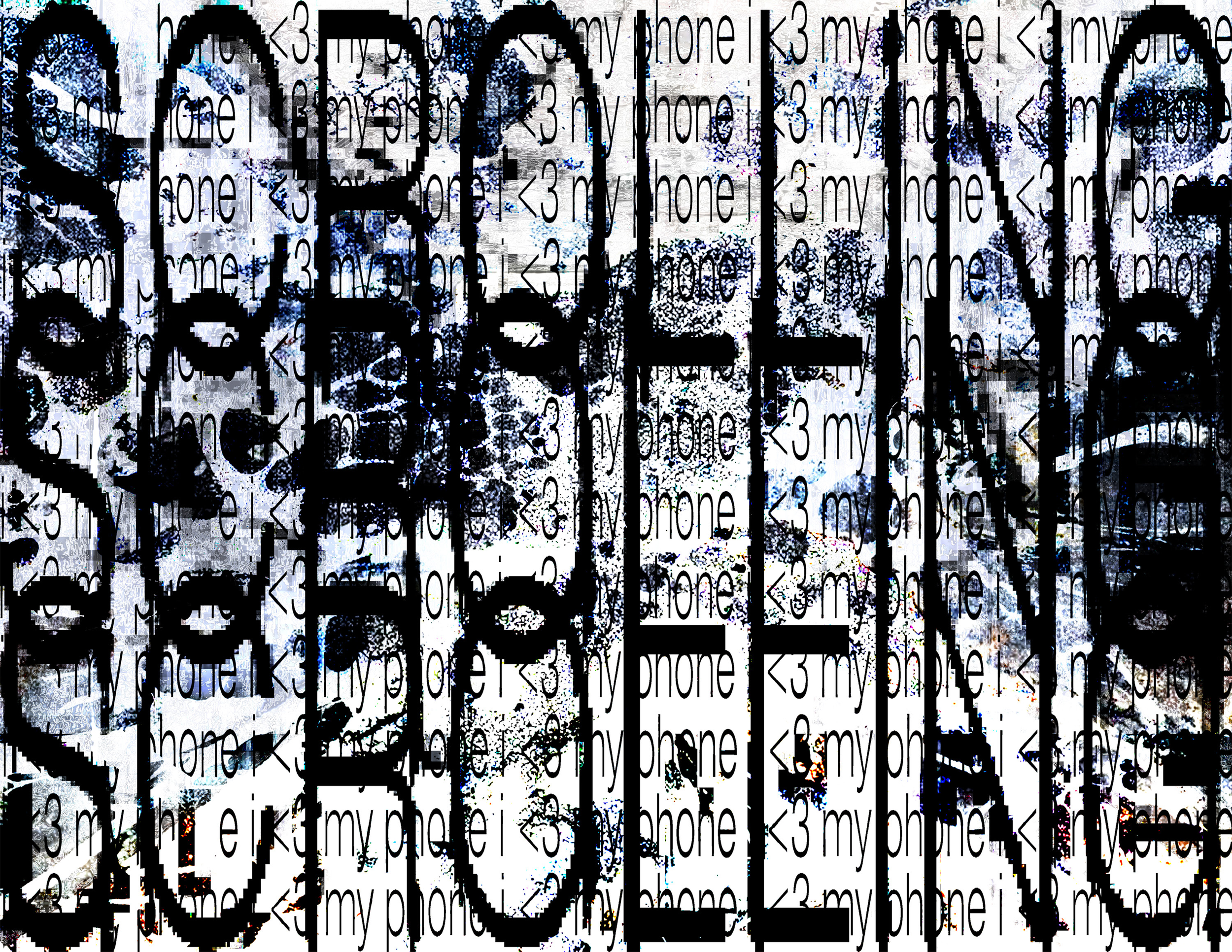
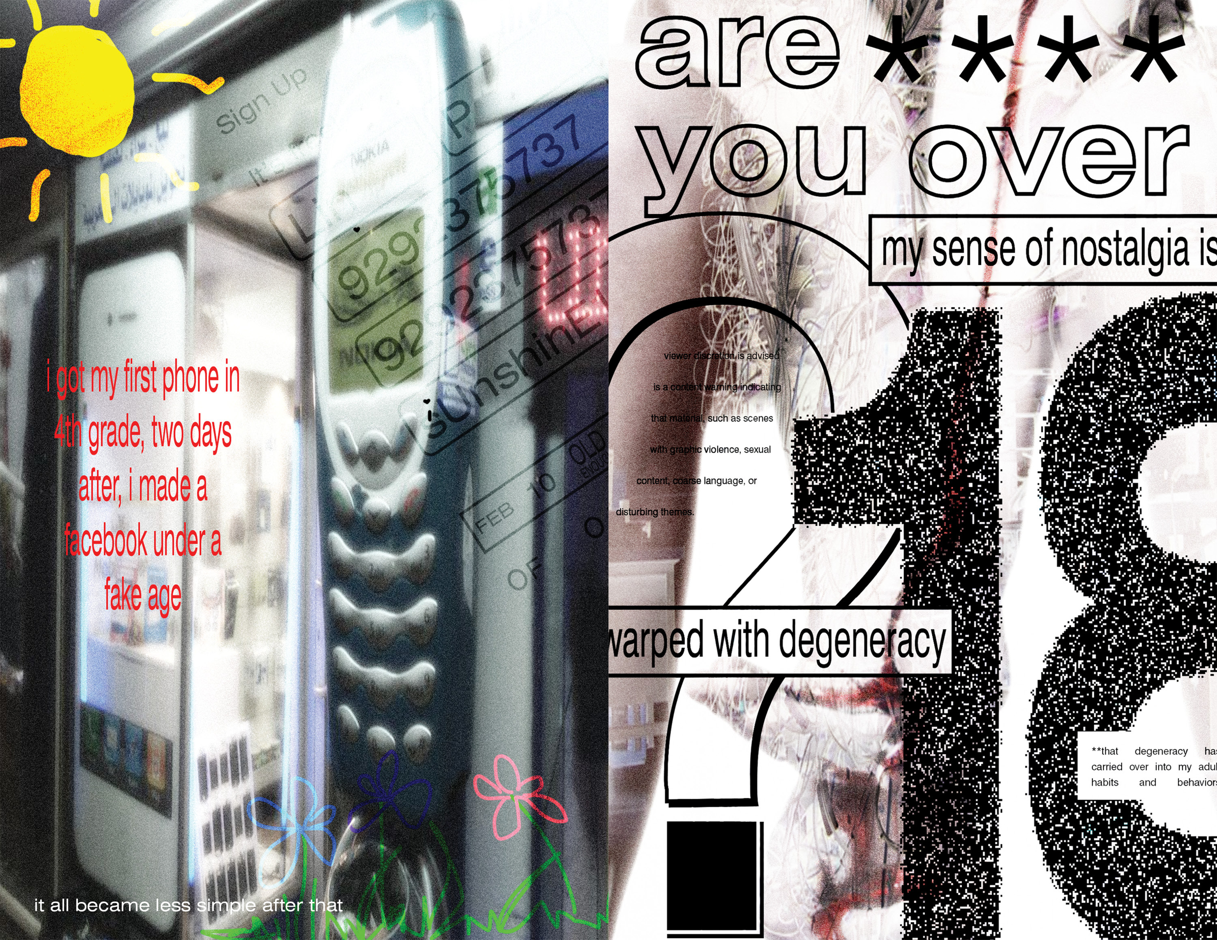
The early pages are colorful, reflecting the early stages of internet use, including games, Microsoft Paint, YouTube, memes, and music. The later pages shift into a moodier, more muted color palette with increased use of typography to reflect how anxious and overwhelming the internet can feel now that I am older, as well as how my relationship with it has changed over time. The shift in the zine is intentionally quick, to mirror how rapidly that change felt in real life.
Design System
When designing loading’s logo, my goal was simplicity, adaptability, and a conceptual tie to the project’s theme.The logo draws from the familiar three-dot loading indicator commonly associated with loading screens. From there, I created an image resembling a circuit, reinforcing the zine’s theme while maintaining a minimal, recognizable shape. The logo is designed to be flexible, and functions as a solid mark, a hollowed outline, or a container for imagery while remaining legible and distinct.
Reflection
This project reinforced the idea that personal experience can function as meaningful design research and how people perceive zine pages. Reflecting on my own relationship with technology revealed how closely my identity is tied to digital environments. I hope people feel the same nostalgia I felt while designing this when they read it.Designer: Lin Pearson
Art Director: Jason Kernevich
Spring 2026, BFA, Graphic & Interactive Design, Temple University
memory vs observation
Each page/spread captures a feeling of being online, from more early playful internet use to more structured and curated digital spaces. The internet is both familiar and overwhelming, sometimes at the same time.
the internet as a lived space
I almost consider the internet a second home. It can be comforting, but it also brings a lot of anxiety, especially when I think about how it shapes my sense of self and self-perception. Can something be home and at the same time fill you with so much dread?